Fixed divs and zooming on mobile
Jan 20, 2014..are two things that are just not meant to be used together, at least as far as I can tell based on personal experience and several questions on Stack Overflow. You can normally account for the mobile viewport’s or browser window’s size/zoom level by the use of CSS media queries, but those don’t work at all when using pinch-to-zoom on mobile devices.
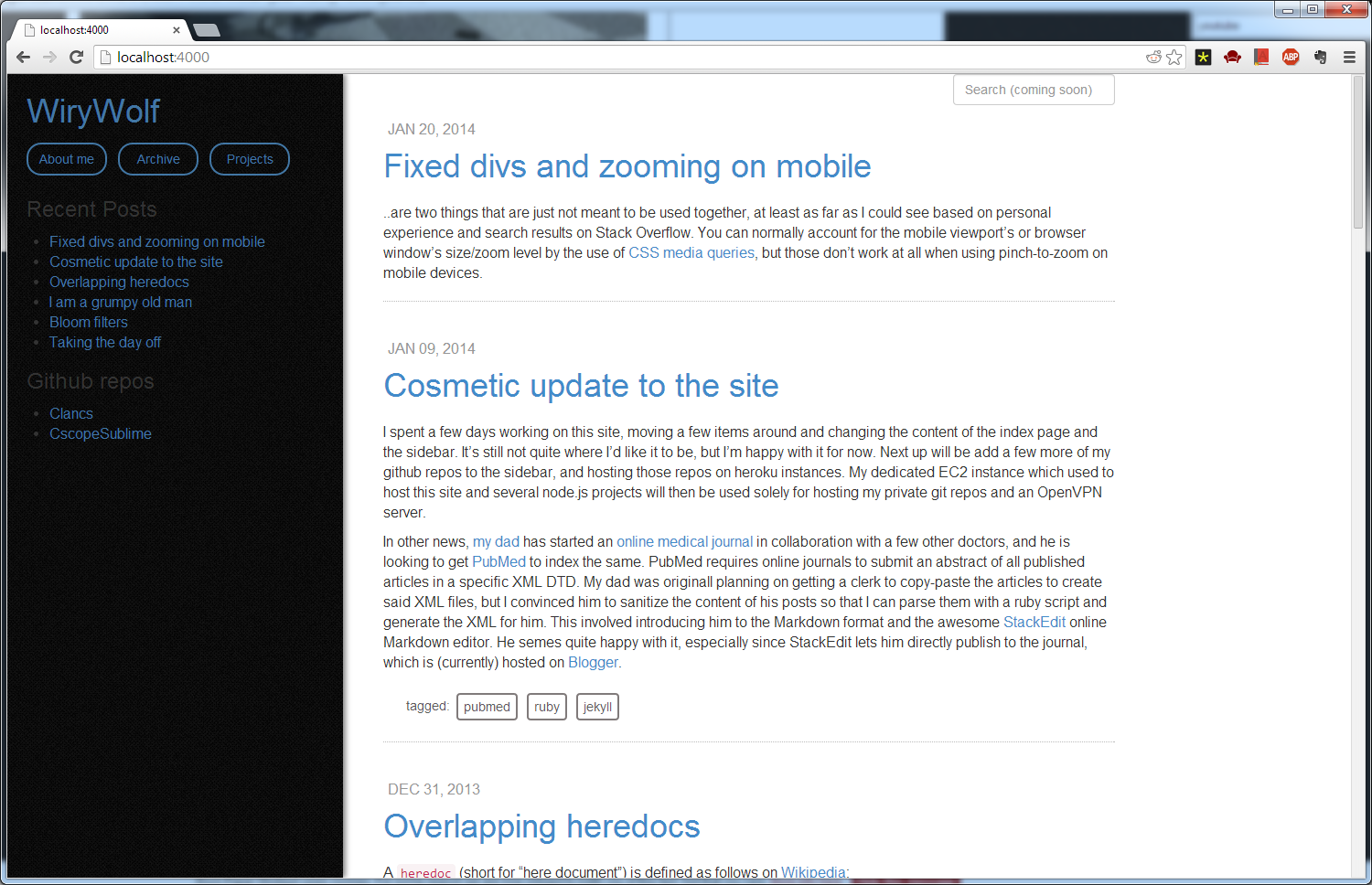
For example, here are three screenshots of an in-progress layout of this site that uses a fixed div for a sidebar, as viewed on a desktop browser. The first image below, is in a large browser window at nearly 1920x1080 size:
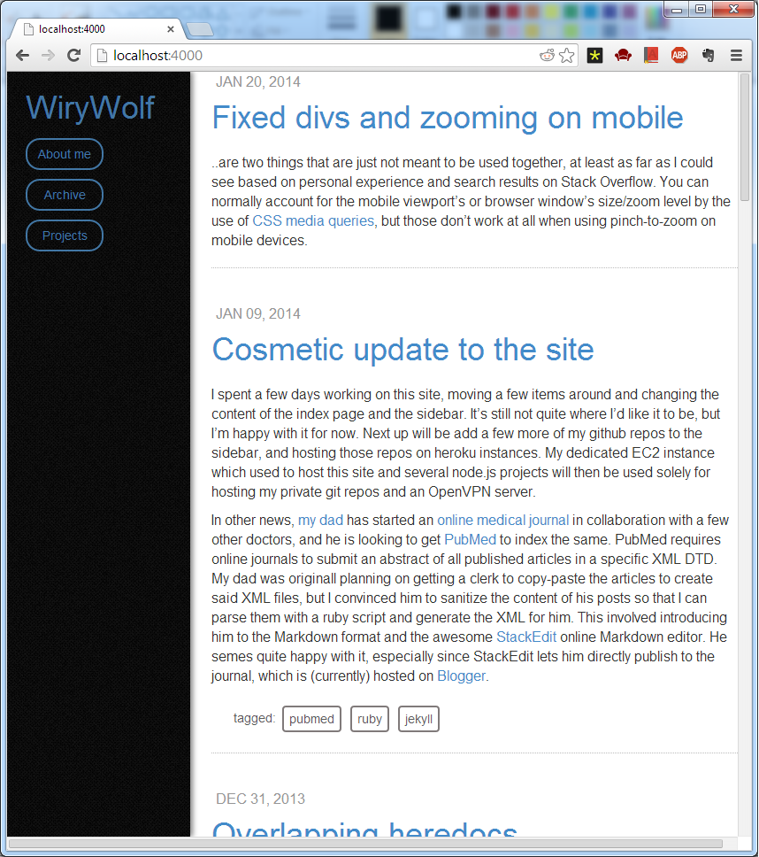
The second image below, is in a browser window that is slightly smaller. As can be seen, the text neatly wraps around to accomodate the smaller viewing size, and the sidebar stays in place.
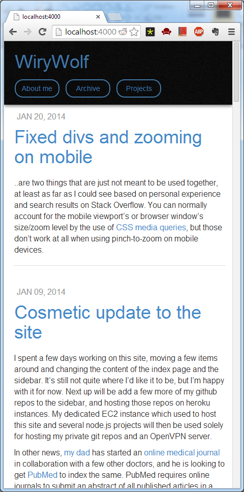
The third image is in an even smaller window, where the sidebar moves to the top of the viewport and is given an absolute position instead of a fixed one. As is evident, the text is still fine.
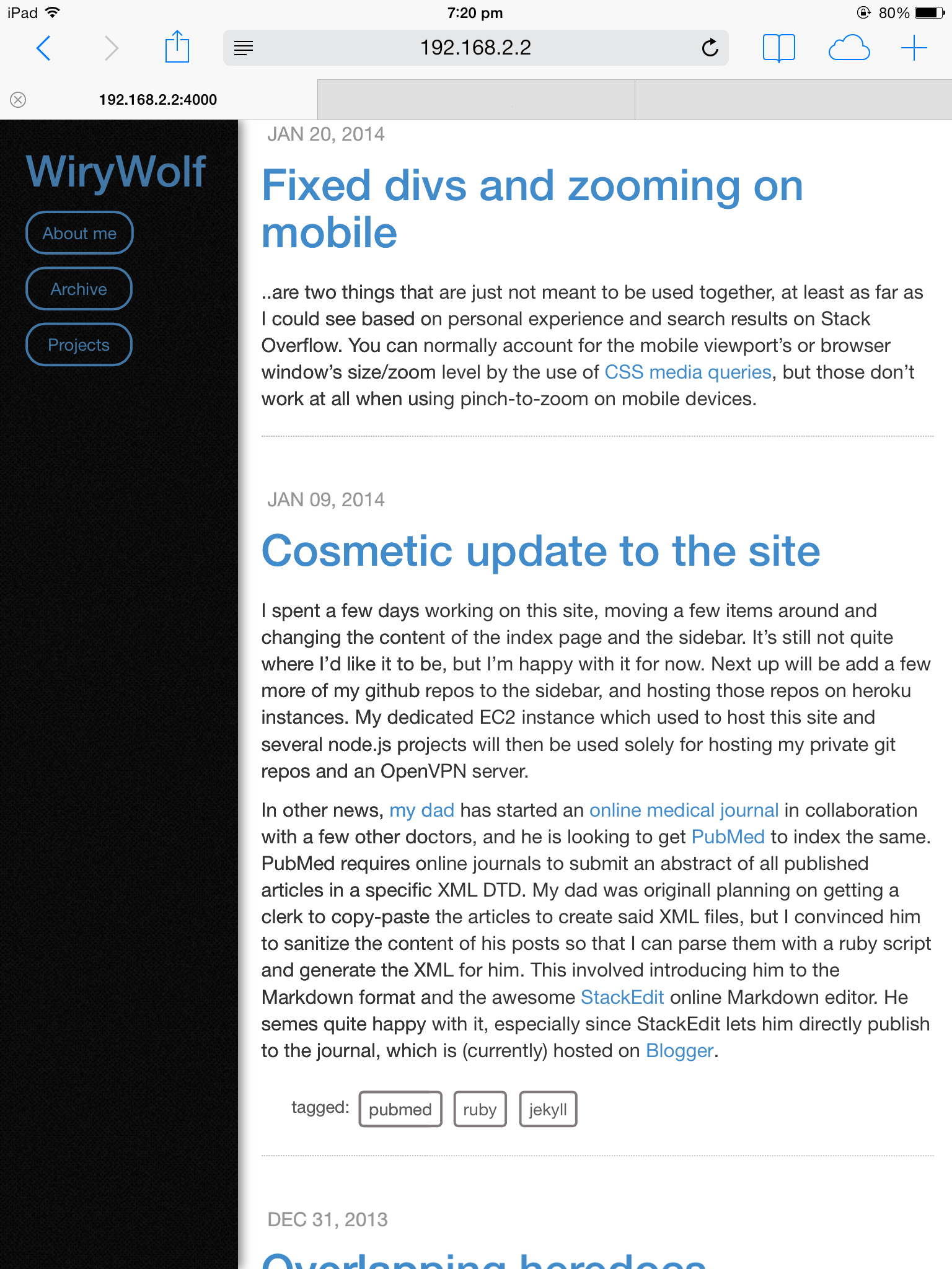
Now, here is the same site, as viewed on my iPad at default scale.
However, if I zoom in, the entire layout gets broken, as can be seen in the following image.
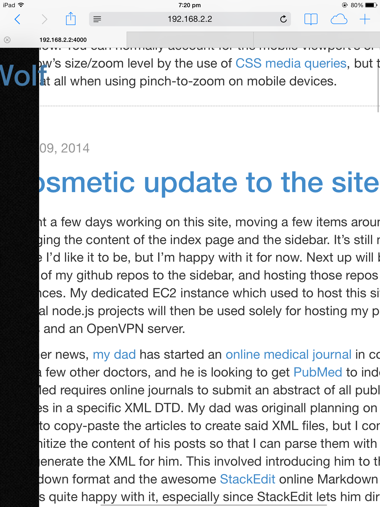
As you can see, the main content div is now overlapping with the sidebar div, which is something that never happened in the desktop browser. Based on google searches, I’ve come to understand that this is a fundamental problem specifically with zooming on mobile devices and fixed divs, and that there are a couple of proposals in place for CSS queries to get the degree of zoom while viewing a page.
Until these proposals are incorporated into the standard, the only option site designers have is to disable zooming, which is not really an ideal solution, but it’s the only workable one if you absolutely need a fixed div in your website. I have settled for what I believe to be an acceptable compromise: disable zooming until a viewport width of 768px, which also happens to be the cutoff for my sidebar to transform into a top navbar. Below 768px, zooming is freely allowed till a maximum scale of 1.5, which I believe should be enough for comfortable reading when combined with a default font-size of 14px. Since the viewport meta tag doesn’t allow such behaviour out of the box, I’ve put in a hacky piece of javascript that gives me the desired behaviour:
function create_responsive_viewport() {
    var ele = document.createElement("meta");
    ele.name = "viewport";
    if(window.outerWidth < 768) {
        ele.content = "width=device-width, initial-scale=1.0; user-scalable=yes, maximum-scale=1.5";
    }
    else {
        ele.content = "width=device-width, initial-scale=1.0; user-scalable=no, maximum-scale=1.0";
    }
    document.head.appendChild(ele);
    }
};